


4
Small Business Coffee & Connect

3
Stop Motion Animation Library Program Promo

5
Jobs and Careers branding
5
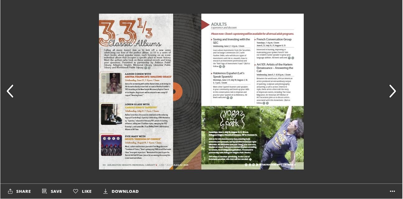
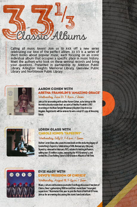
33 1/3: Classic Albums Series

3
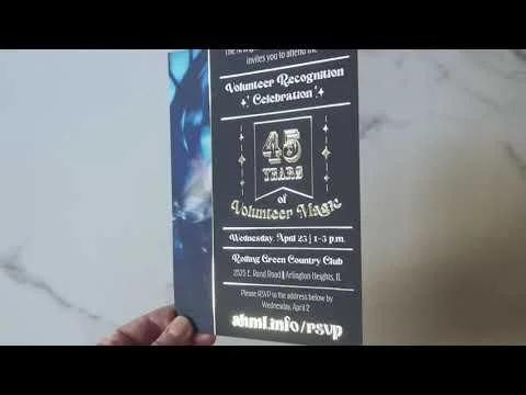
Volunteer Luncheon

7
AHML's Artist in Residence: Magician Jeanette Andrews

6
Library Card Signup Month

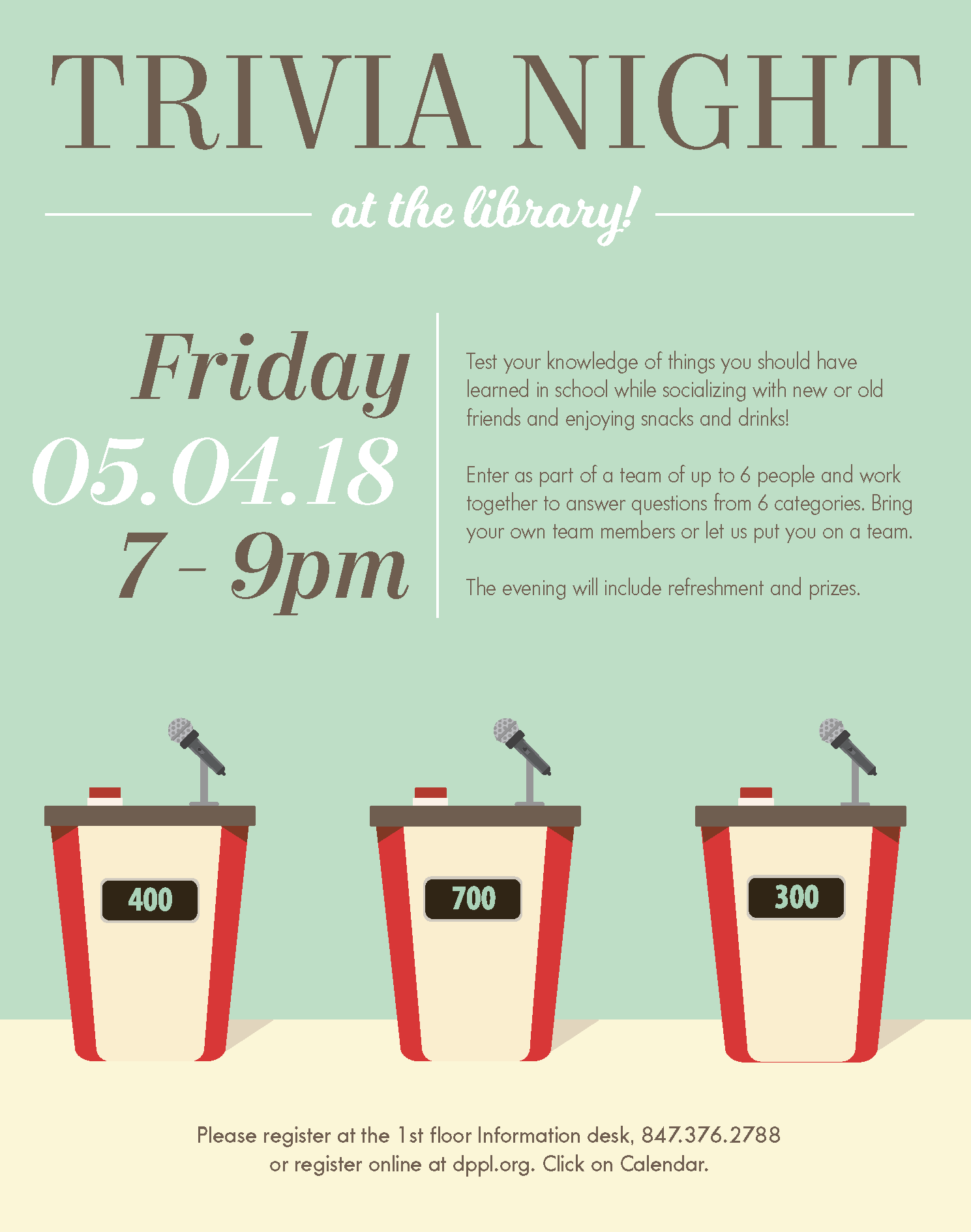
21
DPPL Flyers

3
DP Social Logo

7
Teen Summer Reading @ DPPL

2
Advocate Invitation

2
Chuck Jones Team Building Brochure

12
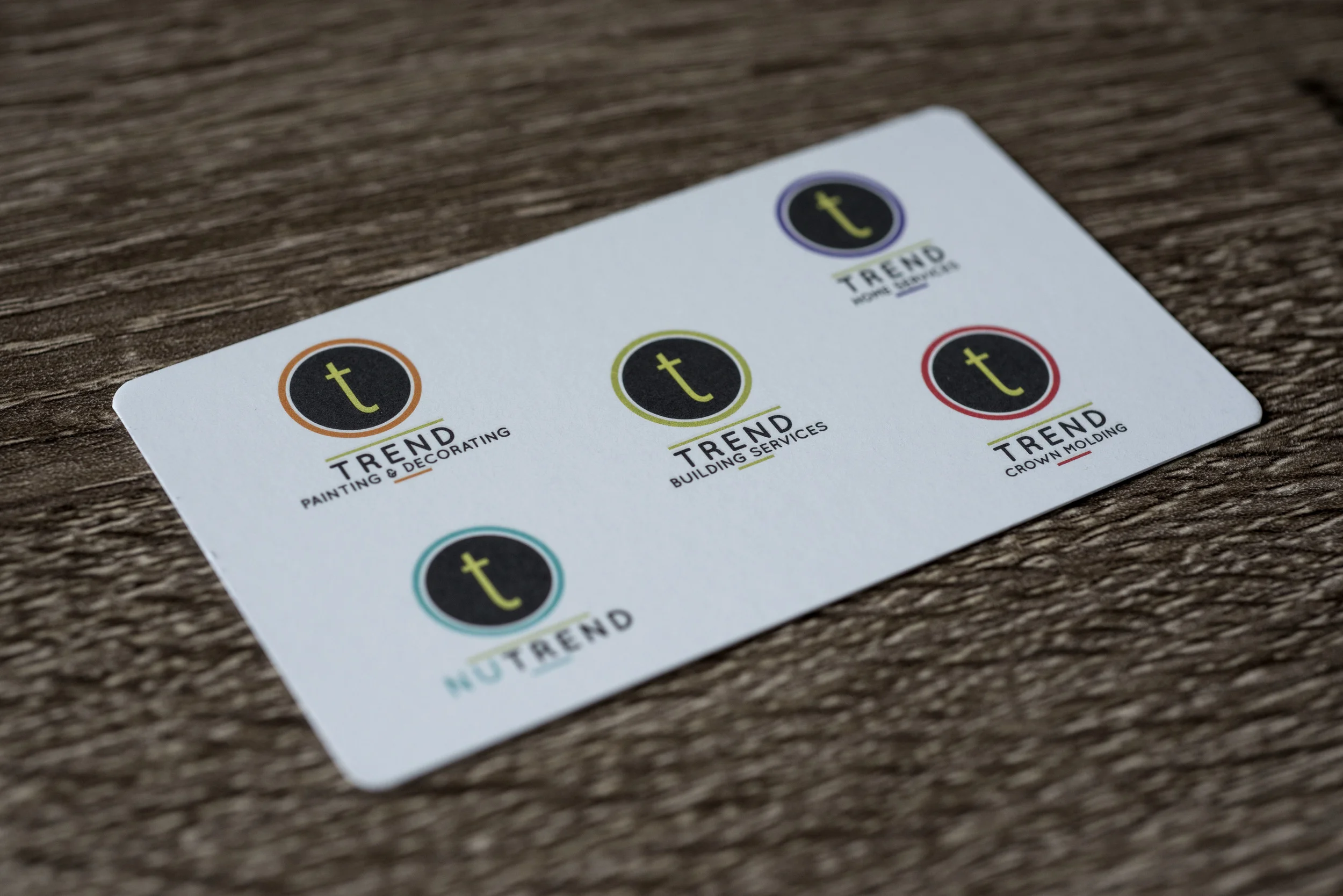
Trend Building Services
4
Snüz Fest

5
YA Book Quote calendar

3
XPerience Point Gaming